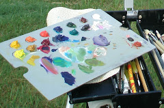
Although I've painted
en plein air with only 3 primaries plus white, I prefer having a wider choice of colors in cool and warm ranges.
The cool row (near left to right) is lemon yellow, yellow ochre, permanent rose, alizarine crimson, ultramarine blue, a cool green (I don't remember which), burnt umber and titanium white.
The warm row (far left to right) is cad yellow, cad orange, cad red light, cobalt blue, viridian green, burnt sienna and titanium white.
The lower right corner holds (top) raw umber (bottom) transparent red ochre.
I've used various color palettes in the past, but I always come back to these colors. There has been speculation as to whether ultramarine blue is warm or cool. My personal view is that its temperature depends on the other colors surrounding it. Many people consider yellow ochre as a warm color, but again I feel its temperature is dependent upon the neighboring colors.
I don't use black in my plein air palette. A wonderful black can be mixed with viridian or sap green plus alizarine crimson. Another black comes from mixing burnt umber plus ultramarine blue. Mixing 3 of my darkest colors presents another black. There is very rarely a pure black in nature. (A lovely green apple color can be made using lemon yellow and just a speck of ivory black...but I still don't carry a tube of black when plein air painting).
When painting greens, I begin with a blue plus a yellow and add hints of other colors until I get the right hue. Although I have green pigment on my palette, I only use it in small touches in other mixtures. And sometimes I never touch the tube greens while painting.
 ...a portion of a 12"x12" acrylic painted/stamped painting on garment pattern tissue...Clicking on the image will show intricate patterns and colors. See more at http://lespapierscolles.blogspot.com/
 ...portion of a 12"x12" acrylic painted and stamped (on clothing pattern tissue) painting ....Reds and yellows merge into oranges, yellows and blues merge into greens...it's wonderful how the eyes will optically mix the colors. Overstamping with blue/purple serves to brighten the colors even more. I thought it might be whimsical to imagine square bubbles.
  ...a large portion of a 12"x12" acrylic painted/stamped paper...I originally saw a mountain under square drifting clouds when this image emerged. But after turning it 180 degrees, I smiled as I saw what appeared to be a boot. Thinking "there was an old woman who lived in a shoe; she had so many children she didn't know what to do"...I named this playful image "Permission to Play".
  12"x10" la papier colle (painted pasted paper)...This is an example of an acrylic painting composed of stamped, painted, inked, torn, pasted and manipulated papers. It's been a lot of fun, and quite liberating, working with this mixed media. More examples and processes can be seen at http://lespapierscolles.blogspot.com/.
  11"x14" oil, painted alla prima, during a TV interview on March 8th...$160 including shipping. Ron Arnold, the Charter Media reporter, had asked me if I'd feel comfortable painting while we did the interview. Since I often talk to people while painting en plein air, I agreed to set up my easel and 'paint away' while we chatted.
 40"x30" oil on gallery wrap canvas - $600 plus shipping - This is another entry for the sky painting exhibit at the Chattanooga Unitarian Universalist Church. Waiting until the last possible day, I decided to use the fastest drying oil paints in my tool box. I chose raw sienna (for the yellow), burnt sienna (for the red), Prussian blue, mauve (blue shade), and flake white. Hopefully they will be touch dry within two days.
 Although I've painted en plein air with only 3 primaries plus white, I prefer having a wider choice of colors in cool and warm ranges.
 40"x30" oil on gallery wrap canvas...$600 plus shipping...During an artists' open studio on Saturday, several painters completed sky paintings destined for an exhibit at the Unitarian Universalist Church in Chattanooga TN.